Spring is finally here, and with it comes one of the most exciting parts of the gardening season—color. From soft pastels to bold, vibrant blooms, your garden can become a living masterpiece when you plant with color in mind.
Whether you’re refreshing your flower beds, styling your patio containers, or planning a full garden makeover, here’s your guide to building a stunning spring garden—one color at a time.
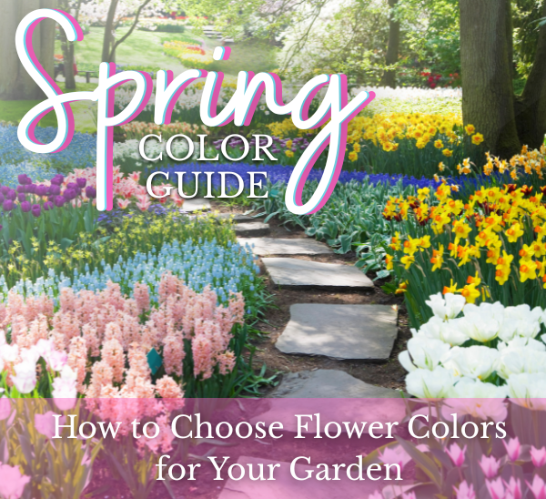
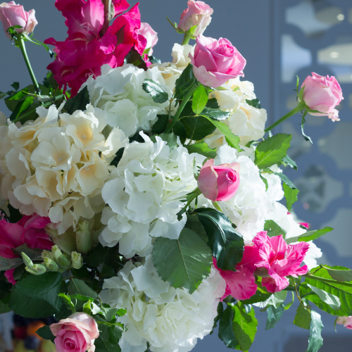
💗 Pretty in Pink
Soft, romantic, and effortlessly classic—pink blooms are a staple of spring gardens.
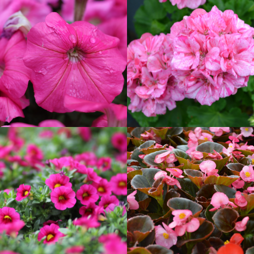
From delicate blush tones to bright, bubblegum hues, pink flowers bring a sense of charm and warmth that feels timeless in any space. They’re perfect for creating that “fresh spring morning” look, especially in entryways, containers, and cottage-style beds.
Top Picks:
Design Tip:
Pink is one of the easiest colors to design with because of how versatile it is. For a soft, romantic garden, layer multiple shades of pink with white flowers and silvery-green foliage to create depth without overwhelming the space. If you want more contrast, pair pink with deep purples or even touches of burgundy for a richer, more elevated look. Pink also works beautifully as a “bridge color,” helping transition between bold tones and softer neutrals in mixed containers or flower beds.
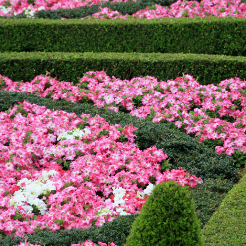
💜 Shades of Purple
Purple adds depth and richness to your garden while attracting pollinators like bees and butterflies.
Ranging from soft lavender tones to deep violet hues, this color brings a calming yet sophisticated feel that elevates any planting design.
Top Picks:
Design Tip:
Use purple to anchor your color palette and create contrast. It pairs beautifully with yellows for a bold, high-energy look, or with pinks for a softer, blended palette. For a more dramatic design, combine deep purples with bright greens or even pops of white to make the color stand out. Plant purple flowers toward the middle or back of beds to add visual depth or use them in containers as a grounding tone surrounded by lighter blooms.
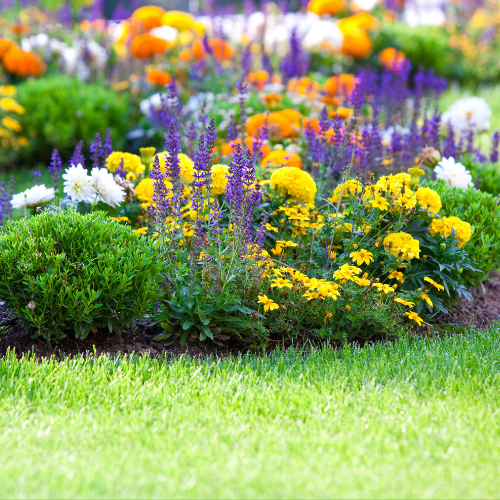
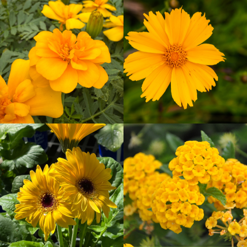
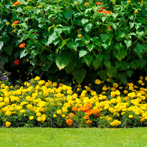
💛 Sunshine Yellows
Nothing says spring quite like bright, cheerful yellow flowers. They instantly bring warmth and energy to any space.
These sunny shades instantly energize your space and bring warmth to any garden, making them perfect for areas where you want to create a welcoming, happy atmosphere.
Top picks:
Design Tip:
Yellow naturally draws the eye, so use it intentionally as a highlight color. Plant it near walkways, entry points, or patios where you want to create an inviting focal point. For a bold spring palette, mix yellow with purples and blues for contrast. If you prefer something softer, pair yellow with whites and light greens for a fresh, airy feel. Adding dark green shrubs or structured foliage behind yellow blooms will also help the color pop even more.
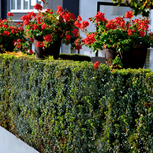
❤️ Bold & Bright Reds
Looking to make a statement? Red flowers bring drama and intensity to your garden design.
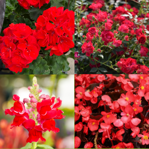
Even a small amount of red can completely transform a space and create a strong focal point.
Top picks:
Design Tip:
Red works best when used with intention. Instead of spreading it evenly throughout your garden, concentrate red blooms in key areas like containers, entryways, or central flower beds to create impact. Balance the boldness by pairing red with whites or soft pinks for a clean, classic look. For a more modern feel, combine red with deep greens or structured shrubs to ground the color and keep the design from feeling too busy.
🤍 Crisp & Classic Whites
White flowers are timeless and versatile, helping to brighten shaded areas and balance bold color combinations.
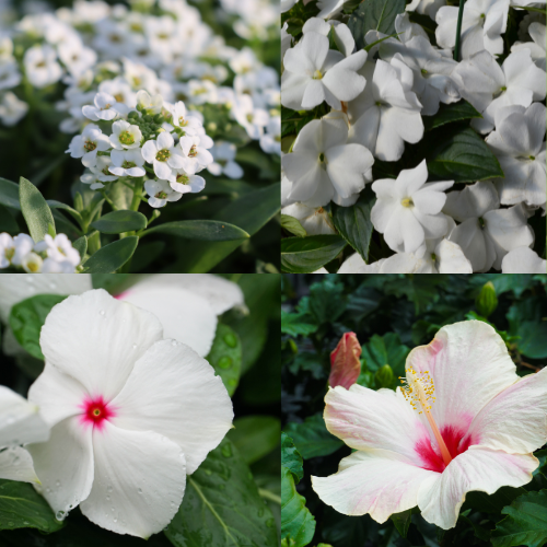
They brighten shady areas, reflect light beautifully in the evening, and help tie together more colorful plantings.
Top picks:
Design Tips:
Think of white as your garden’s “balance tool.” Use it to break up bold color combinations and give the eye a place to rest. White pairs seamlessly with every color—softening reds, enhancing pinks, and adding contrast to purples. For an elegant look, create a mostly white garden with layers of green foliage. Or weave white flowers throughout colorful beds to create rhythm and cohesion across your entire space.
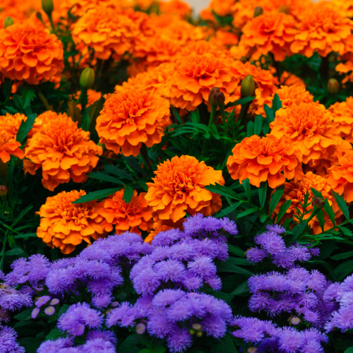
🧡 Warm & Vibrant Oranges
Orange tones bring warmth and a playful energy that bridges the gap between bold and soft color palettes.
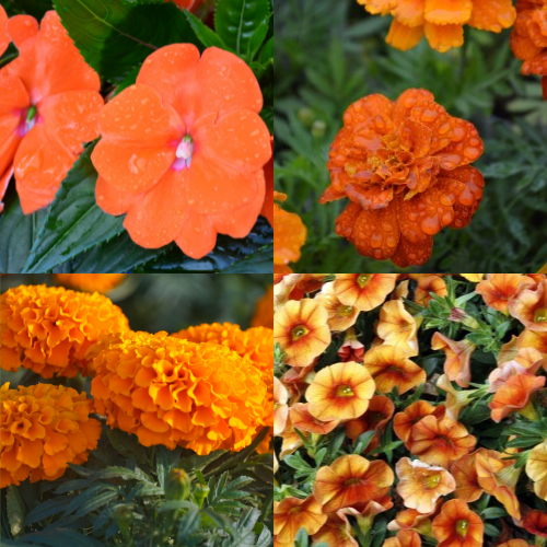
Sitting right between red and yellow on the color wheel, orange is perfect for creating dynamic, eye-catching combinations.
Top picks:
Design Tip:
Orange thrives in both bold and balanced palettes. For a warm, sunset-inspired look, combine it with reds and yellows to create a glowing, cohesive design. If you want more contrast, pair orange with purples or deep blues to cool things down and make each color stand out even more. Orange also works beautifully in containers—especially when mixed with trailing greenery—to create a vibrant focal point for patios and outdoor living spaces.
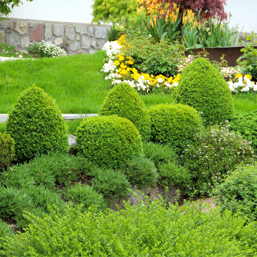
🌿 Don’t Forget the Greens
While flowers steal the spotlight, lush green foliage is what ties everything together.
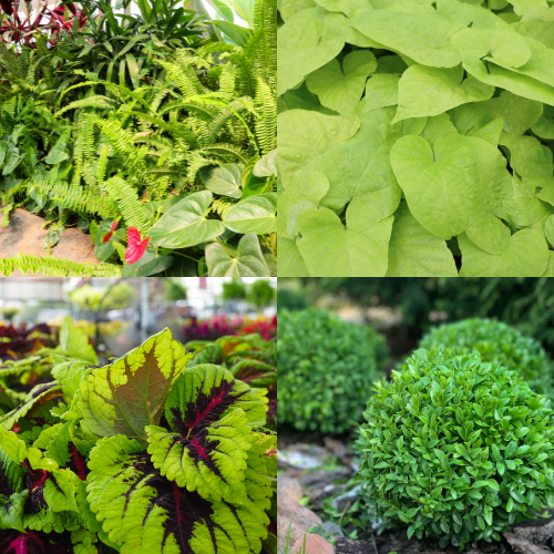
It adds texture, fullness, and contrast—helping every bloom stand out while giving your space a polished, finished look.
Top picks:
Design Tip:
Layering different shades and textures of green is the secret to a professional-looking garden. Use taller greenery to create structure, medium plants to fill in space, and trailing varieties to soften edges and containers. Green also acts as a visual reset between bold colors, preventing your garden from feeling overcrowded. The more intentional you are with your greenery, the more vibrant and balanced your flowers will appear.
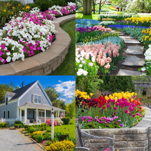
🌼 Design Tips for a Colorful Spring Garden
- Pick a palette: Stick to 2–3 main colors for a cohesive look
- Mix heights & textures: Combine tall, medium, and trailing plants
- Layer your colors: Place bold colors as focal points and softer tones around them
- Use containers for flexibility: Easily swap colors throughout the season
🌷 Let’s Get Planting!
No matter your style—bright and bold or soft and subtle—there’s a spring color palette waiting to come to life in your garden.
Stop by your local Calloway’s or Cornelius to explore our wide selection of spring blooms and let our Texas Certified Nursery Professionals help you design a garden that’s uniquely yours.
👉 Visit us in-store or shop online to get started today!
How to Choose the Best Colors for Your Garden
Spring gardens often feature a mix of soft pastels like pinks and purples, along with brighter tones like yellows, reds, and oranges. The best color choice depends on your style—whether you prefer a calm, cohesive palette, or something bold and eye-catching.
Start by selecting 2–3 main colors you love, then build around them with complementary shades and greenery. Sticking to a defined palette helps your garden feel intentional and visually balanced.
Yes—but with intention. Use one or two dominant colors, then add accent colors sparingly. Incorporating white flowers and greenery can help break up bold combinations and keep your garden from feeling overwhelming.
Bright colors like purple, yellow, orange, and blue are especially attractive to pollinators. Flowers like salvia, lantana, and verbena are great options for creating a pollinator-friendly garden.
Repeat colors throughout your space and use greenery to connect different areas. Layering plants with varying heights and textures also helps create a more polished, professional look.
Yes! Bright colors like yellow and orange thrive in sunny areas and stand out well in full light. In shady spaces, lighter tones like white and soft pinks help reflect light and brighten the area. Always look at your plant tag or ask one of our Texas Certified Nursery Professionals if you need help choosing the right plants for your garden.
You can refresh your garden seasonally or whenever you’re ready for a new look. Using containers makes it easy to swap out flowers and experiment with new color combinations throughout the year.

Marketing leader with 10+ years of experience, blending creativity with deep, hands-on knowledge of the horticulture industry. Energized by plants, sports, good food, and great style.